


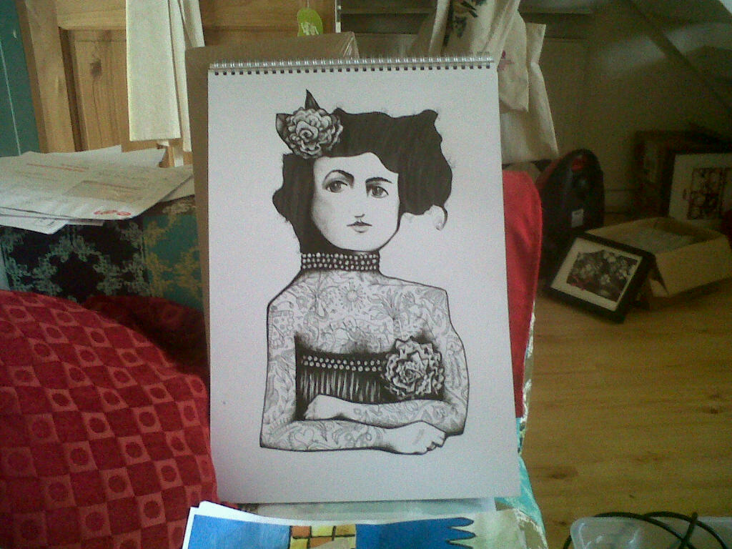
Sold these sketches that I finished a few days ago to a private collector! If you’re interested in works, email me [email protected] for an availability list before they go!
Cheers  #rodluff #drawings #originals
Sold these sketches that I finished a few days ago to a private collector! If you’re interested in works, email me [email protected] for an availability list before they go!
Cheers #rodluff #drawings #originals


Here’s the final step discussing the process of “Wanderlust". Hope some of you find this useful and interesting. Thanks for the feedback and support!
Inspired by recent sunsets, I began crushing some orange, pink and purple pastels and mixing them with iridescent media and painting in the background colours around the bottom third of the sky.
After watching a flock of cockatoos flying at sunrise near my studio, I added tons more owls in the background, drawing them with coloured pencil, pastel and iridescent white. I had to keep them desaturated and tonally close to the background so they didn’t interfere with the foreground.
I filled out the leaf silhouette more, imagining them weaving around musically and outlined them in red/orange pencil to give them more glow and define the unique shape more.
Then I wasn’t happy with the unity and strength of the picture, so I layered all the foreground with GAC100 and water, and some acrylic to unify it. Then I glazed some areas in oil paint to give it more depth, particularly in the darkest areas like the ground, leaves, vines and below the foot etc.
I used iridescent white oil paint, liquin and crushed pastels to brighten the chroma of the glowing areas, particularly on the owl faces. The shiny, reflective qualities of the media is useful for the mimicking surfaces of leaves.
I left the background without the GAC and oil glaze, so that it would appear lighter, dry and more airy, with the materials closer to the surface.
Thanks for reading!

Here’s the next installment of my progress discussion of “Wanderlust" recently completed for my solo show, Aurora at Thinkspace Gallery LA.
I kept adding layers of iridescent medium or iridescent white paint mixed with crushed pastels and acrylic and water to layer the opaque colours you see- the leaves, owls, body, etc. I also combined that with some hatching using a pen or a coloured pencil to give it depth and form. I had to redraw the face a lot. It was a struggle!
I made the top nest/head leaves yellow and orange, cascading down the body to yellow green, silvery green and a deeper green at the legs for a colour shift effect.
I also counterbalanced this colour gradient by making the owls faces go from blue in the bottom right, to blue green, to green, to yellow green, through to yellow up the top. I feel like making these colours shift adds movement.
The leaves give a wavelike silhouette to the foreground which is enjoyable to play with, I’m trying to give everything as much rhythm and variety in shape and colour as possible while maintaining the unity.
I haven’t decided what to do with the background yet, but now that the foreground and middle ground elements are done, it’s time to tackle that.
I’ll post the last step tomorrow. Thanks for reading!

One of the new drawings I’ve been messing around with the past few days. It’s for fun, not for a show. This one features a forest nymph at midnight in commune with some psychedelic owls. It’s 11" x 14", pencil + pastel + acrylic on paper. It’s called “Whispers."


Top piece- Neon Cherub II is still available. Please check out show info if you’re interested
Bottom piece- Owl Gang has already sold.
Just a few more days left to check out "Aurora" at Thinkspace Gallery LA. They’re open 12-6 pm today, Thurs, Fri and Saturday Ag 3rd this week, which is when the show comes down.
Hope you get a chance to see it!

Just a quick sketch from yesterday, getting back into the groove of drawing. Got some new stuff on the way. Oh and it’s available for a cheap price. Just email [email protected]


Here’s the next installment of “Wanderlust" progress shots for my solo show "Aurora" at Thinkspace Gallery LA. Hope some of you find it useful.
With the lines blocked in, I dived into the green areas and particularly the dark areas. I can’t work further without establishing some of the lower tones, and because pencil wasn’t dark enough, I used ink-micron pens. If I don’t establish the dark areas, it’s easy to make the light areas too dark in comparison. Having a good range of tones is crucial for colour as well, because colour is closely linked to the tone.
For the leaves, vines, grass and stone pillar, I used a combination of layering acrylic, crushed pastels and liquitex iridescent medium. I then work over it using coloured pencils.
For the light areas I used iridescent white paint and crushed pastels.
I’m just experimenting and laying the foundation colours for the piece, balancing the warms and cools, and building texture with a lot of hatching and cross hatching, etc.
Thanks for looking! More coming soon.

This is just a small sketch I finished yesterday. Getting back in the groove of drawing before I finish anything bigger.


Thanks everyone for such nice feedback!I’m normally too embarrassed to post this in full. Hope this helps in some way.
I transferred the prelim to a larger, wider format. I raised the owl above her head to give that area space. The ground is extended, the tree root sweeps into the picture from the left up to her foot. If the vine is the baseline, the owls are the rhythmic beats on top. The owls wrap around her foot in a circular fashion to echo the circular elements such as their faces and the Nest.
I also emphasised a triangular structure. A main diagonal leads up from bottom left owls up to her head. The one on the right starts from the bottom right owl, up the vines with leaves arranged like a spinal column through the nest and up to the main top owl. I’m trying to echo the triangular shape in the body which is made by the resting leg, stretched arm and back.
There’s a smaller triangle involving the vines on the stone pillar, the owl standing on top (in front of her knee) and the owls below. It’s embedded inside to echo the main pyramid with the main owl above the nest.
I’m trying to make the picture rhythmic and interesting and learning about all this as I go.
Thanks for reading!

9" x 12" quickie I finished today. Working on a few different drawings at the moment, just simple studies like this to get back in the groove. If you wanna buy it, email me [email protected] it’s a cheap one.

Based on feedback I received, I’m posting about the progress of “Wanderlust." This is the preliminary drawing and although it takes longer to make a first draft, I need to give myself permission to fail. Before this, I think I did around 20-30 or so really rough pen thumbnails/sketches where I tried to decide on the format, rhythm and composition. I decided on the vertical format. In the case of this drawing, the anchor point is the foot on the ground and I tried to push the energy away from there and sweep in from the left side background through to the right.
I’m also trying to figure out where the negative space should be and how to balance that with detail. In this case I failed and it didn’t feel stable enough, mainly because the bottom right corner should be more grounded. I was trying to make it look as though it was disintegrating in a flurry of leaves. I was also deciding where the main horizontal, vertical and diagonals would be. It’s also really hard to arrange the owls in nice groups, so I needed to practice that and see how it would turn out- I try to connect them together and think of them as rhythmic additions to the overall feel.
I added a lot of detail because I know that I can always transfer it to the final piece and it’s not wasted effort.
I’ll post the next step soon which will be the final drawing linework, and talk about the changes. Hope you found this helpful.

I had to post one more picture by http://kellythenerd.tumblr.com/ of my conversation with Rod Luff. www.rodluff.com to see more of his art and here too: rodluff.tumblr.com/
Thanks to Kelly http://kellythenerd.tumblr.com for taking some photos of our podcast today at Thinkspace Gallery! More to follow soon!
I’ve been tuning in to the podcast “Conversations with Matt Dwyer" for over a year since it first began. It was my honour to be given the chance to be on the podcast, which took place in Thinkspace Gallery surrounded by my art for the solo show “Aurora."
Please follow Matt’s tumblr below and give his podcast a spin, I guarantee it’ll make long car trips or waiting in line at the airport infinitely more entertaining!
http://feralaudio.com/show/conversations-matt-dwyer/
I just interviewed Rod Luff who did the picture below. His work is currently at Thinkspace Gallery 6009 Washington Blvd. | Culver City, CA 90232. It’s really amazing to see in real time. I mean, it’s amazing here on tumblr but there is so much going on when one gets their fat greasy face up close…

